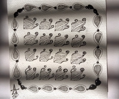
How many of you can spot the lopsided heart in this work? Please comment when you do ;)
Weekly Challenge #203: "UMT - Athitzi by Eleanor Holt"
This is my work for the weekly challenge #203. I feel it looks like a snowflake, maybe m still hungover from the Christmas & New year holidays. But........I really enjoyed the tangle 'athitzi'. It's fun and if your like me (a little too obsessive on details) then this tangle is going to be one of your favourites!
Something special............called LIFE
This one is for you Daddy...Rest In Peace
I started this drawing thinking how precious life is and we do not realise that UNTIL.....well obviously death.
Weekly challenge #193
I know...I am late! I had this drawn by last Wednesday, but it has so many mistakes I did not want to post it. Never to lose hope when simple pencil shading can fix it....Ta-Daa after the shading well I must be honest I love the tile!
But I hate Huggins!!!.."..It got so loony after I kept repeating it! I think my brain just went all buzzzzzzz......
Botticelli's Three Graces - WIP
This is one of my ambitious works! That is for sure...Right now I am in a phase where I want to know what painting technique works best for me. So I started to experiment with different painting methods that I am interested in.
I wanted to do a part of Botticelli's "La Primavera" and I choose The Three Graces.
In this post I shall be telling you about my composition and the painting method I followed.
The background of my painting is a collage of two of Raphael's paintings, with the Three Graces.
The background and colours are inspired from the above two paintings.
The method I followed is one interpretation of the Old Master Painting methods and can be found in http://brassgoggles.co.uk/forum/index.php?topic=11073.0
I have to tell you before hand that I have not followed the steps mentioned in the above link sequentially. I mixed yellow ochre and a tiny bit of black acrylic paints and used that colour to cover the white of the canvas(don't know why I did that!.). But since I had covered my canvas with dark yellow ochre-ish colour, I thought I'll just continue with the steps mentioned in the link.Then I drew the figures and used burnt umber to place the shadow areas. After this I did the scumbling with titanium white. While doing this I also painted the background almost to completion.
Will continue talking more about this in my next post...
I wanted to do a part of Botticelli's "La Primavera" and I choose The Three Graces.
In this post I shall be telling you about my composition and the painting method I followed.
The background of my painting is a collage of two of Raphael's paintings, with the Three Graces.
The background and colours are inspired from the above two paintings.
The method I followed is one interpretation of the Old Master Painting methods and can be found in http://brassgoggles.co.uk/forum/index.php?topic=11073.0
I have to tell you before hand that I have not followed the steps mentioned in the above link sequentially. I mixed yellow ochre and a tiny bit of black acrylic paints and used that colour to cover the white of the canvas(don't know why I did that!.). But since I had covered my canvas with dark yellow ochre-ish colour, I thought I'll just continue with the steps mentioned in the link.Then I drew the figures and used burnt umber to place the shadow areas. After this I did the scumbling with titanium white. While doing this I also painted the background almost to completion.
Will continue talking more about this in my next post...
Starter kit - Lino Printing
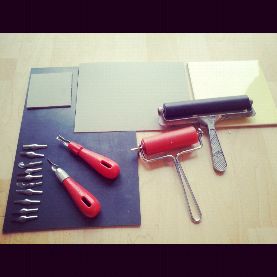
Recently I started with Lino printing or Lino cuts and thought I'd share what I have learnt so far and all the materials needed for Lino printing. Firstly, let me just say I got most of my materials from eBay- its relatively cheap and I get it at my door-step! Other than that I got a few Lino pieces from Atlantis art materials (a huge art supply store).
Now for the things needed to start with Lino printing:
1.) Lino sheets - there are different types of lino sheets available. I have two types so far, the dark greyish blue one got from eBay and the lighter grey one i got from Atlantis art store. Of the two the dark lino is softer and i have used that so far and like it! Soon will have a design for the light grey one (which is harder but i think it should be ok) and will post how it it is. Also they are available in different sizes for you to choose from.
2.) Lino Cutters - there are different kinds of blade and then the blade handle. I got a set of 5 blades and 1 handle again from eBay! Well they are quite enough but i got irritated changing the blades often while carving a design so got an extra handle and loads of different blades from Atlantis. They are pretty cheap and i feel its nice to have spares....i got three No 1 blades as i use these to make fine lines...
3.) Ink or block printing paints - i got black, blue and crimson Daler Rowney block printing colour, which are water based colour and easy to wash off!
Then there is the oil based colour, i got a tin to see how it works. Well these are water miscible so they can be washed with warm water and dish wash liquid but its messy and difficult and like me if you are printing at your home be careful when washing!
Both give really nice results but with the oil based colour i feel the print is a tiny bit better so worth all the mess..
Now for the things needed to start with Lino printing:
1.) Lino sheets - there are different types of lino sheets available. I have two types so far, the dark greyish blue one got from eBay and the lighter grey one i got from Atlantis art store. Of the two the dark lino is softer and i have used that so far and like it! Soon will have a design for the light grey one (which is harder but i think it should be ok) and will post how it it is. Also they are available in different sizes for you to choose from.
2.) Lino Cutters - there are different kinds of blade and then the blade handle. I got a set of 5 blades and 1 handle again from eBay! Well they are quite enough but i got irritated changing the blades often while carving a design so got an extra handle and loads of different blades from Atlantis. They are pretty cheap and i feel its nice to have spares....i got three No 1 blades as i use these to make fine lines...
3.) Ink or block printing paints - i got black, blue and crimson Daler Rowney block printing colour, which are water based colour and easy to wash off!
Then there is the oil based colour, i got a tin to see how it works. Well these are water miscible so they can be washed with warm water and dish wash liquid but its messy and difficult and like me if you are printing at your home be careful when washing!
Both give really nice results but with the oil based colour i feel the print is a tiny bit better so worth all the mess..
4.) Rollers - i got these from eBay as well. You would need 2 rollers one to roll the paint and other to roll over the paper so the paint transfers evenly while printing from the lino cut. The one rolled on paper is called hand burnisher and you get it as a set with the roller and blades and handle. But i just use a larger roller.
5.) Glass plate or tiles - to put the paint and roll them.
6.) Paper - i use all kinds of paper! from hand made paper to cartridge paper...its fun to experiment.
Hmmmm.........I think i have covered everything here...happy printing :)
Mirror Mango - 2
Mirror Mango - 2
Acrylic on canvas
Here is the link to my first painting in this series:
http://colouredbitsoflife.blogspot.co.uk/2012/05/mirror-mango.html
Lino printing
I have decided to teach my self Lino printing and I am pretty happy with my Lino cuts. These photos are just the trail prints I do to know how my Lino print will look and if I have to change anything.
Mystified Feelings
I had a long strip of canvas and thought i can do small paintings with a common theme. Then i thought it would be nice to paint my feelings, and THAT would be the common theme and i can fill the length of the canvas with small 6x6 inch paintings.
This is my first painting depicting my feelings on the day i painted it (which has been a few weeks back!) and i like the idea of filling up the canvas this way :)
Mystified Feelings
6x6 inch
oil on canvas
Mirror Mango
Lately I have been obssesed with Indian Folk art and this painting is inspired by the traditional mango motif and folk design. The mango motif is called PAISLEY PATTERN and seems to be quite famous.
My painting is a diptych, one is the reversed image of the other hence the name "Mirror Mango". I would love to see the diptych hanging in an ornate, hand carved frame (without the protective glass and the supports) when its finished.
![]() |
![]() |
Print Mania
Recently I attended a class in print-making and these are some of prints i did there.Well it was mostly related to the 2012 Olympics but these are off topic ones that i managed to do.I feel printing can be addictive - its easy,fast and kick starts your creativity. And all that you need are a couple of rollers, glass plates(can even be a big tile) and a few colours of water based inks.
Old Master Painting Method
Hi.......
This post I thought I’ll tell you guys how I paint and since I started the volunteer work at The Wallace Collection I am more determined to learn about eighteenth and nineteenth-century French paintings and their technique. For now I mostly like the Dutch and Flemish method of painting, which is also known as 7 layer method. As the name says it all it’s done with multitude of paint layers (not just 7!!) of transparent oil paints. I learnt this method by reading about Rembrandt, Rubens and other artists of the 17 -18th century. Also I bought DVD lessons from Johnnie Liliedahl (who has some excellent old master reproductions DVD lessons) and Alexei Antonov's video Workshop “Claret Grapes". These video lessons did help me in improving my technique and brush-work and the most importantly in understanding the colour mixing for old master paintings.
![]() |
| Umber final layer |
![]() |
| Umber final layer |
![]() |
| Dead layer 1 |
![]() |
| Dead layer - final |
![]() |
| Final colour layer |
![]() |
| Final colour layer |
<a href="http://www.bloglovin.com/blog/3487803/coloured-bits-of-life?claim=z5t4ykqtxab">Follow my blog with Bloglovin</a>
Subscribe to:
Posts (Atom)


.gif)